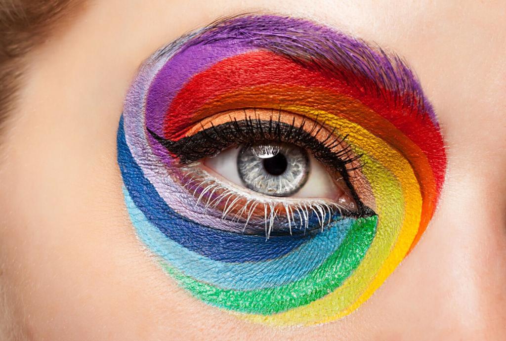
Utilizing Color Theory for Emotional Impact in Rooms
Understanding the influence of color on mood and atmosphere is essential when designing any space. By applying principles of color theory, it is possible to shape emotional responses, enhance functionality, and create a particular ambiance within a room. This approach goes far beyond simple aesthetic choices: colors can energize or soothe, foster creativity, encourage relaxation, and even improve social interaction. Harnessing the psychological power of color allows designers, homeowners, and business owners alike to craft spaces that are not just beautiful, but also deeply effective in meeting desired emotional outcomes.
Warm colors like red, orange, and yellow are often associated with excitement, energy, and warmth. In living rooms or dining areas, red can spark conversation and draw people together, while orange may encourage enthusiasm and creativity. Yellow, with its associations of happiness and optimism, can uplift the mood and inject vibrancy. However, it’s important to use these hues thoughtfully, as their intensity can sometimes overwhelm and even provoke feelings like irritation or restlessness if overapplied. By integrating touches of warm color—whether through accent walls, furnishings, or décor—designers can intentionally amplify the energy in a room, making it feel lively and inviting.
The Psychological Effects of Color
Creating Productive Workspaces
In offices or study rooms, selecting color palettes that encourage concentration and productivity is critical. Soft blues and greens are popular choices here, as they promote focus and reduce mental fatigue over long periods. Accent colors like muted orange or yellow can inject subtle energy without causing distraction, striking the right balance between stimulation and calm. The overall goal is to facilitate a sense of clarity and motivation. By applying color theory, designers ensure that the room not only looks appealing but also actively supports those working within it to perform at their best.
Inviting Social Interactions in Gathering Spaces
Areas intended for socializing—such as living rooms, dining rooms, or entertainment zones—benefit from warmer, more inviting color schemes. Incorporating shades like terracotta, deep reds, or golden yellows stimulates conversation and creates a welcoming environment. These hues encourage people to linger, interact, and feel comfortable within the space. At the same time, carefully balancing these bold shades with neutral elements prevents overstimulation and keeps the mood enjoyable. Through nuanced color selection, gathering spaces can be rendered both lively and harmonious, uniquely suited to bringing people together.
Fostering Restful Environments
When designing bedrooms, meditation areas, or quiet reading nooks, the emphasis turns to colors that soothe and nurture relaxation. Soft pastels, muted blues, gentle greens, and cool lavenders are often chosen for their tranquil properties. These colors help lower heart rate and encourage restful sleep or peaceful contemplation. Avoiding overly saturated tones or intense contrasts ensures that a calming ambiance is maintained. Color theory thus acts as a guide in curating environments that both look and feel restorative, ultimately enhancing overall well-being through strategic design.

When multiple rooms are visible from one another, choosing a cohesive color palette helps foster a natural flow. Triadic or analogous color schemes can offer variations while maintaining a unified look, preventing abrupt or jarring transitions. Using recurring accent colors or gradient variations as a thematic thread connects spaces emotionally and visually, reinforcing feelings of stability and order. Harmonizing colors isn’t about making everything uniform, but about crafting a curated journey that feels intentional and pleasing as you move from room to room.

Effective design requires a careful interplay between contrast and harmony. High-contrast pairings, such as navy with white or teal with mustard, inject visual excitement and drama—but too much can feel fragmented or overwhelming. Conversely, overly harmonious schemes using only similar tones may become monotonous. Color theory helps designers judiciously apply contrast to highlight certain features or zones within a room, while ensuring overall harmony preserves a sense of tranquility. This balance cultivates spaces that are visually dynamic, yet emotionally consistent and comfortable.
A home or space reflects the identity of its occupants, and color is a powerful avenue for personal expression. Bold accent walls, unique art, or vibrant furnishings can all reveal elements of a person’s character and taste. However, maintaining overall balance remains paramount to avoid chaos or distraction. Core color schemes grounded in theory allow for personalization without sacrificing the unifying emotional effect. Through mindful design, rooms can express individuality while remaining inviting and emotionally resonant.